

Brand
Guidelines
To use RaiseTalks brand materials in your services and content, review the terms, seek permission, attribute the materials, avoid alterations, and use them responsibly.
Download assetsVersion June 2026
Our logo
Our full logo is composed of two elements: the logomark and the wordmark — each capable of standing alone in contexts where space, format, or application requires it. It should be used on a white or light background whenever possible to ensure maximum clarity and impact.
The WORDMARK is our primary logo and the default representation of RaiseTalks across all touchpoints.
All other versions (logomark only, logomark + wordmark, or the two-line variant) are alternative representations and should only be used when the primary wordmark cannot be applied. For guidance on those cases, refer to the logo usage guidelines on the following slides.


Logomark
Wordmark
Primary logo use
Our logo is designed for use on white or very light neutral backgrounds, while our white version is available for use on dark backgrounds or brand gradients. In contexts requiring single-colour output (embossing, engravings, stamps, or B&W documents), use the official full-black or full-white variants only — do not attempt to convert the logo manually.
 Primary logoWhite logoBlack logoWhite logo
 White full logo
 Black full logo
 White full logo
Two-line wordmark
When horizontal space is limited, the two-line wordmark is the approved alternative to our primary logo. It carries the same visual identity in a more compact, vertically-oriented format.
Like the primary wordmark, it comes in four approved versions matched to a specific background context: Full colour (for white or light backgrounds), white (for brand gradient or dark backgrounds), and full black
 Full colour logo
 White logo
 Black logo
Logomark use

Primary Logomark

Legacy (Alternative) Logomark
The blue logomark is our primary and most recognizable brand sign, and should be used in all current applications.
The orange logomark represents a legacy version of the brand. While it may still appear in older materials, it is now considered an alternative and should be used selectively.






We may also use our deconstructed version of logomark as a design element across our visual system.
Its shapes and forms may be applied in backgrounds, patterns, highlights, and compositions to create a cohesive and expressive brand language.
Logo protection & misuse
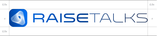
Maintain sufficient space around the logo, at least 0.5x of the Y height of the full logo.
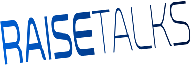

Don't stretch, compress, or skew the logo — always scale proportionally.

Don't recolour the logo — only approved colour variants may be used.

Don't place the logo on busy photography or textured backgrounds without proper contrast.

Don't scale the logo below a size where it becomes difficult to read or recognize. If logomark is included, its height must be at least 24px.

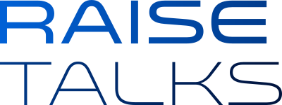
Don't recreate or modify the logo in any way — always use official brand assets.
Brand colours
Primary colours
#003687
Authoritative Navy
#0077FF
Electric Blue
Accent colours
#EA2640
Bold Red
#FFAB0E
Warm Amber
Our primary palette is built around two blues: a deep, authoritative Navy and a bright, energetic Electric Blue. Together, they communicate trust and forward-thinking momentum.
Our accent colours; Bold Red and a Warm Amber introduce energy, urgency, and creativity.
Gradient colour systems
#0077FF#003687
Main gradient
#EA265F#FF6929
Alternative gradient
Gradients are a core element of our visual language. Built directly from our brand colors, they add depth, motion, and a sense of progression to the brand.
Typography
Poppins— primary brand font
We use Poppins across all brand and product contexts.
Poppins is a geometric sans-serif with clean, open letterforms - it communicates modernity and approachability without sacrificing professionalism.
As a Google Font, Poppins is widely available and optimized for use across web, mobile, and desktop environments. This ensures consistency in how our brand is presented, regardless of platform or device
Sample
The quick brown fox jumps over the lazy dog
Sample
The quick brown fox jumps over the lazy dog
Download assets
Grab the official logo files below. Please use them as-is — see the usage rules above before publishing.
Press & contact





 Book a call
Dariia Vasylieva
Founder & CEO
Looking for the platform? Go to RaiseTalks